Maps
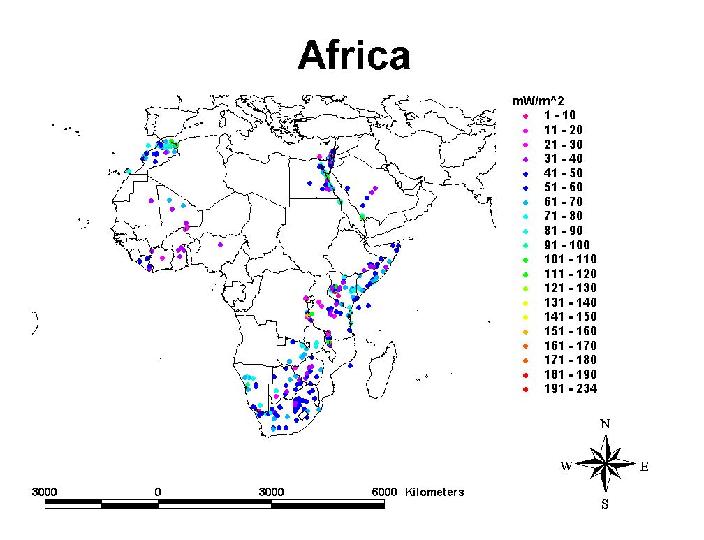
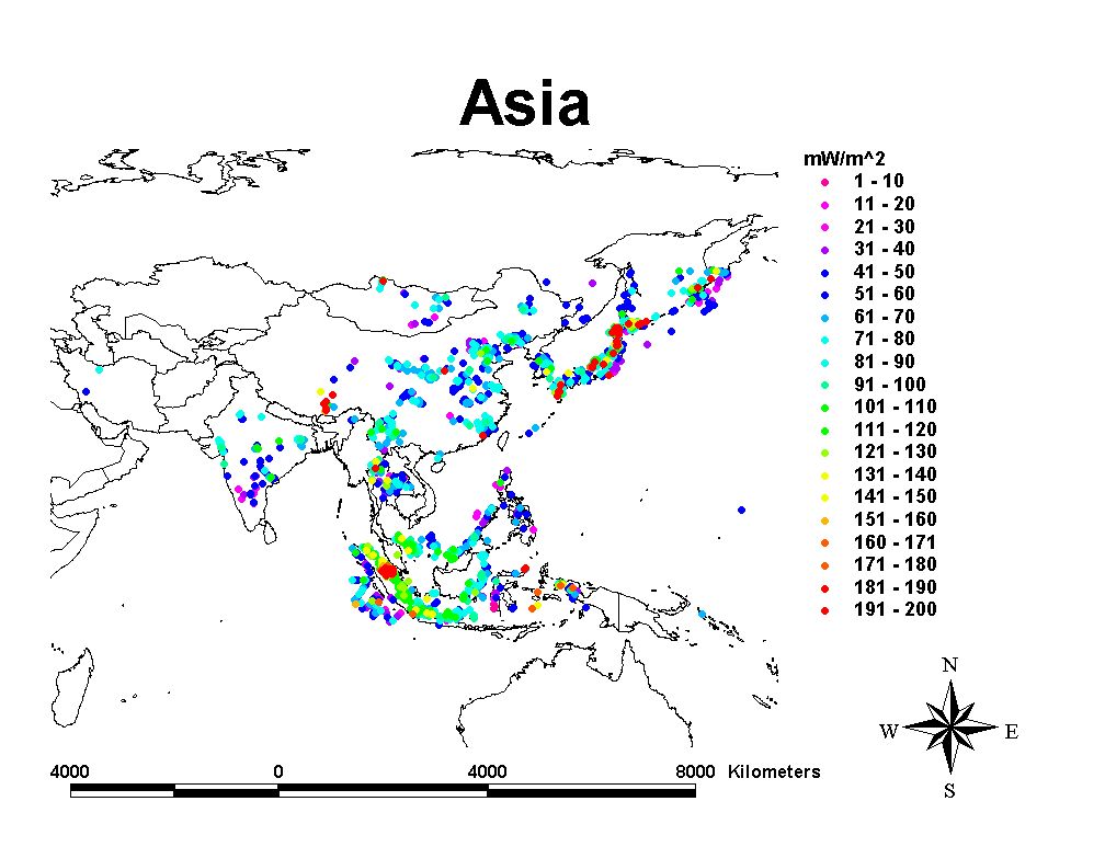
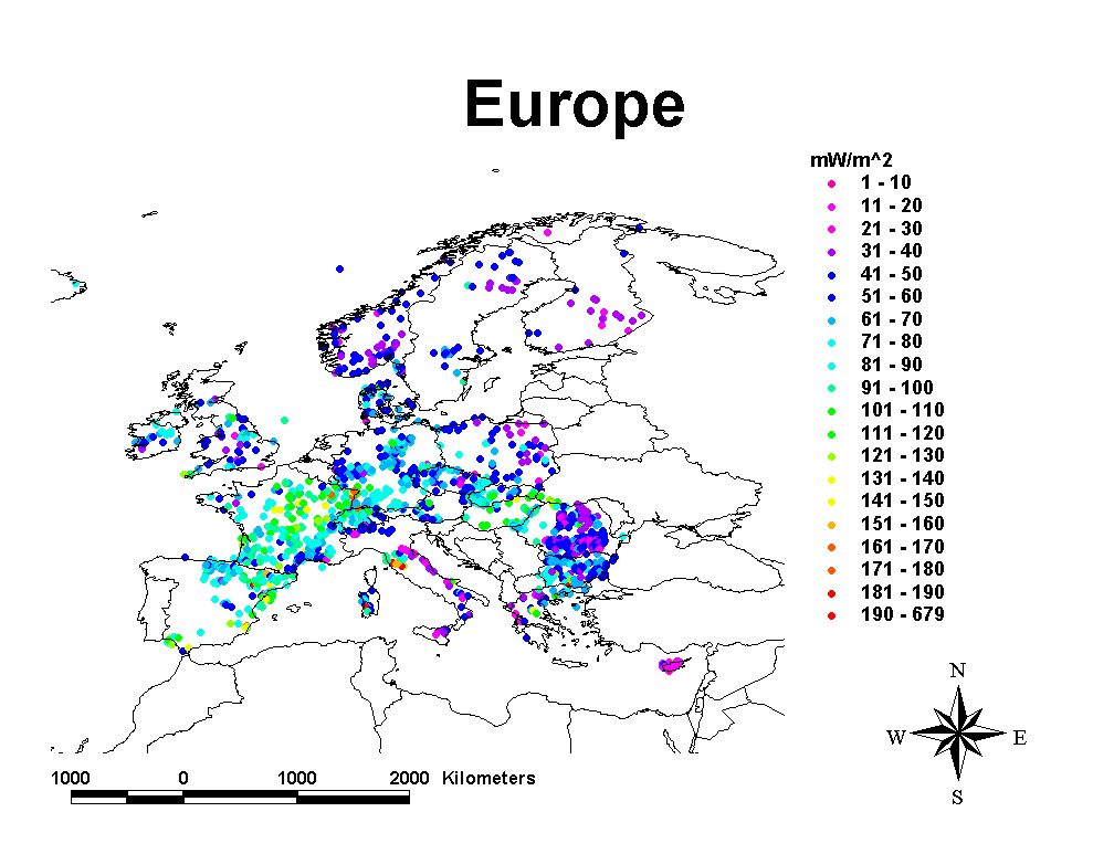
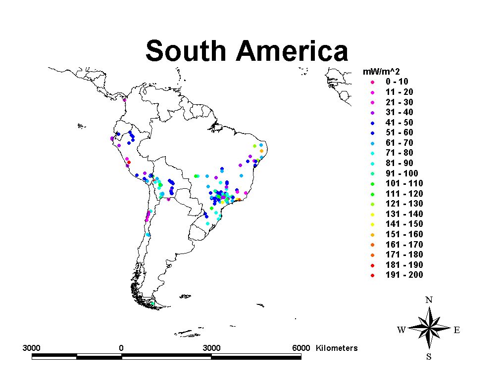
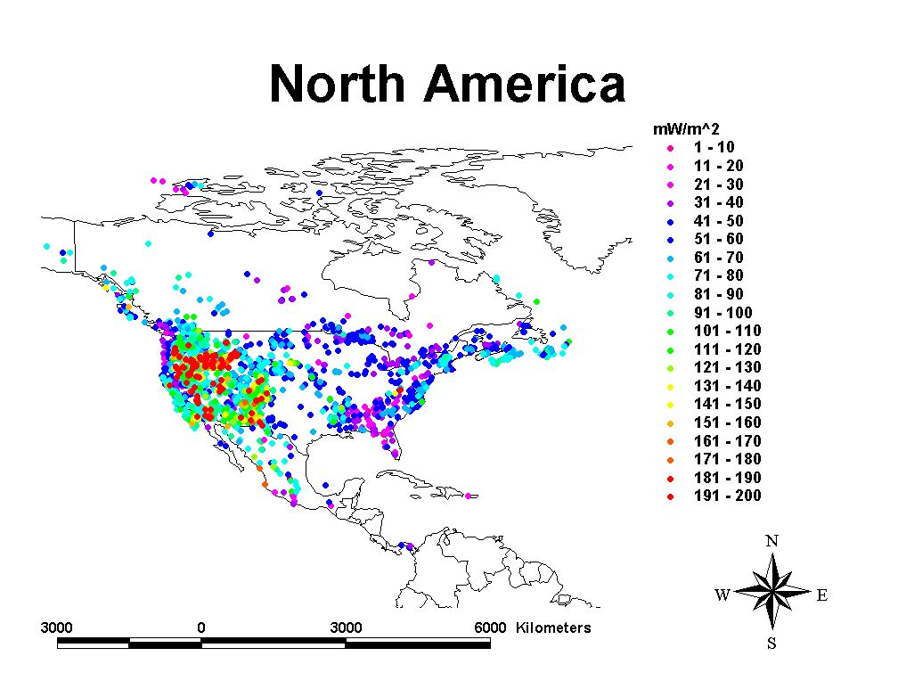
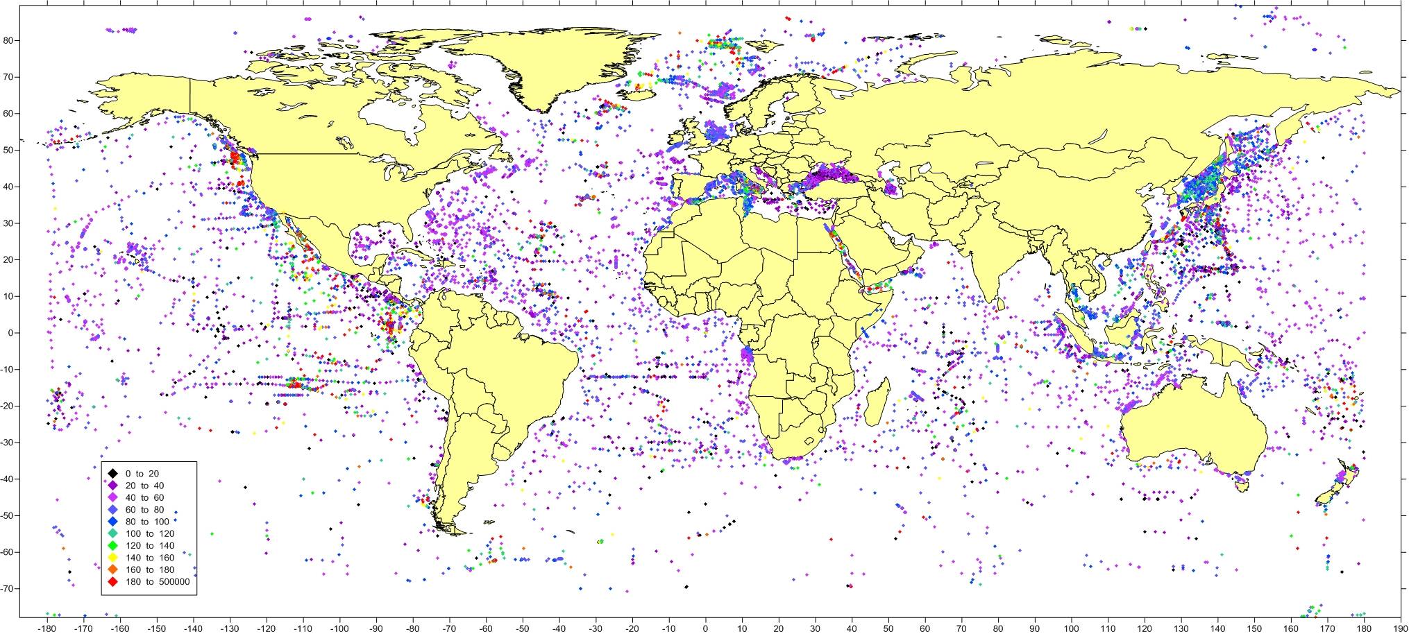
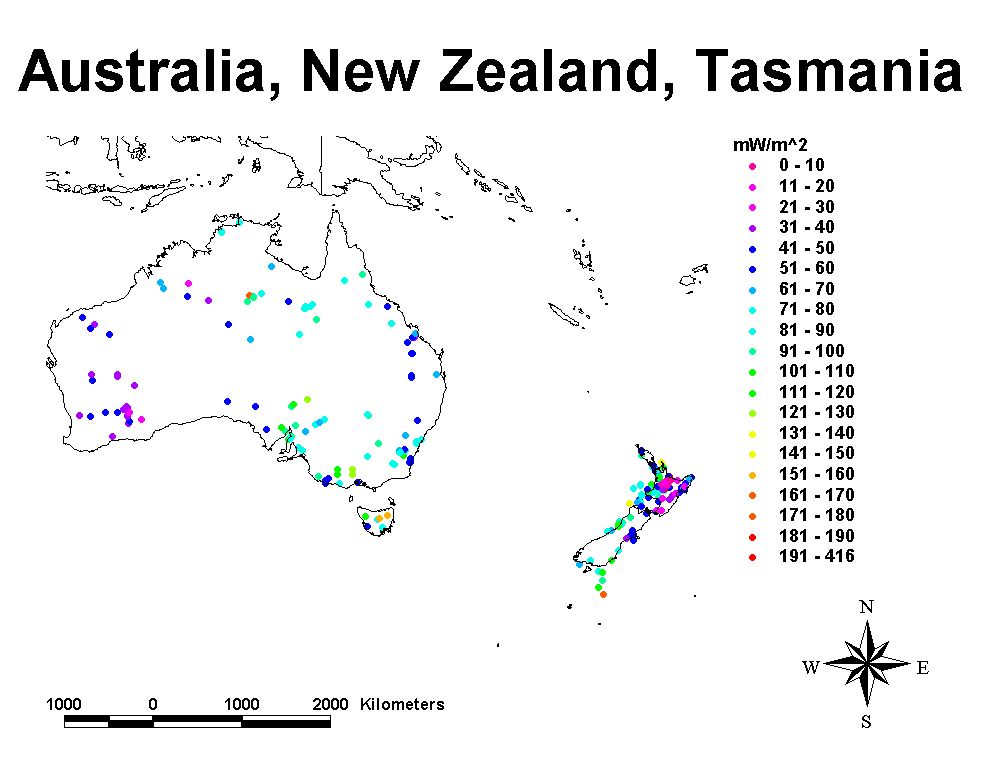
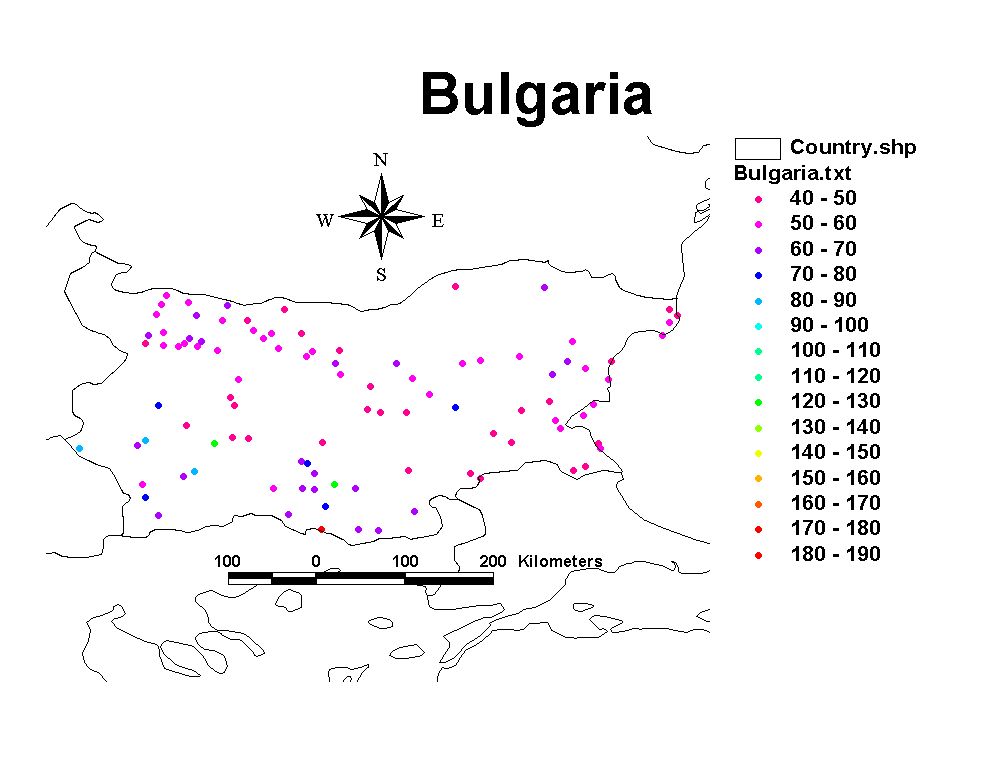
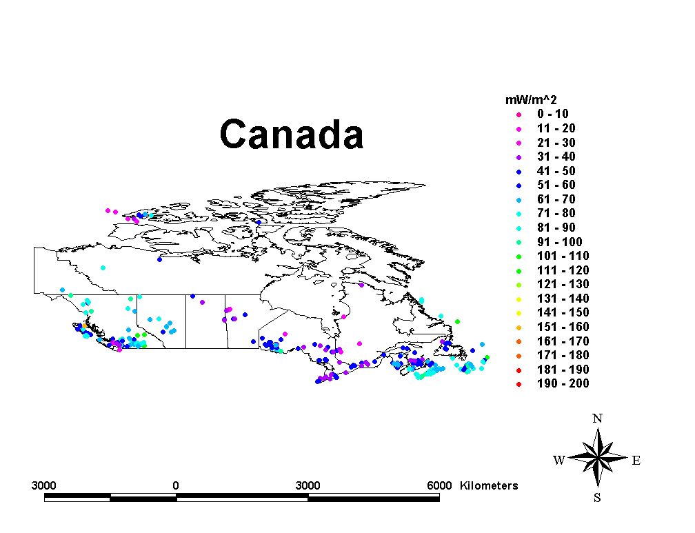
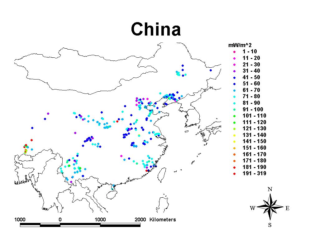
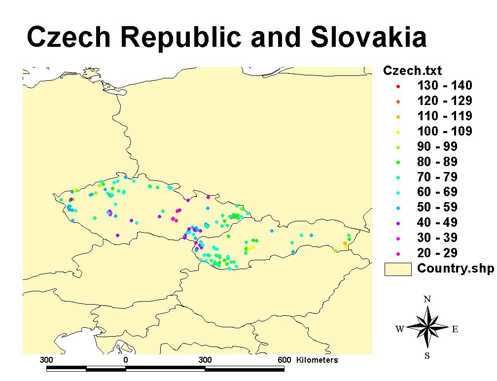
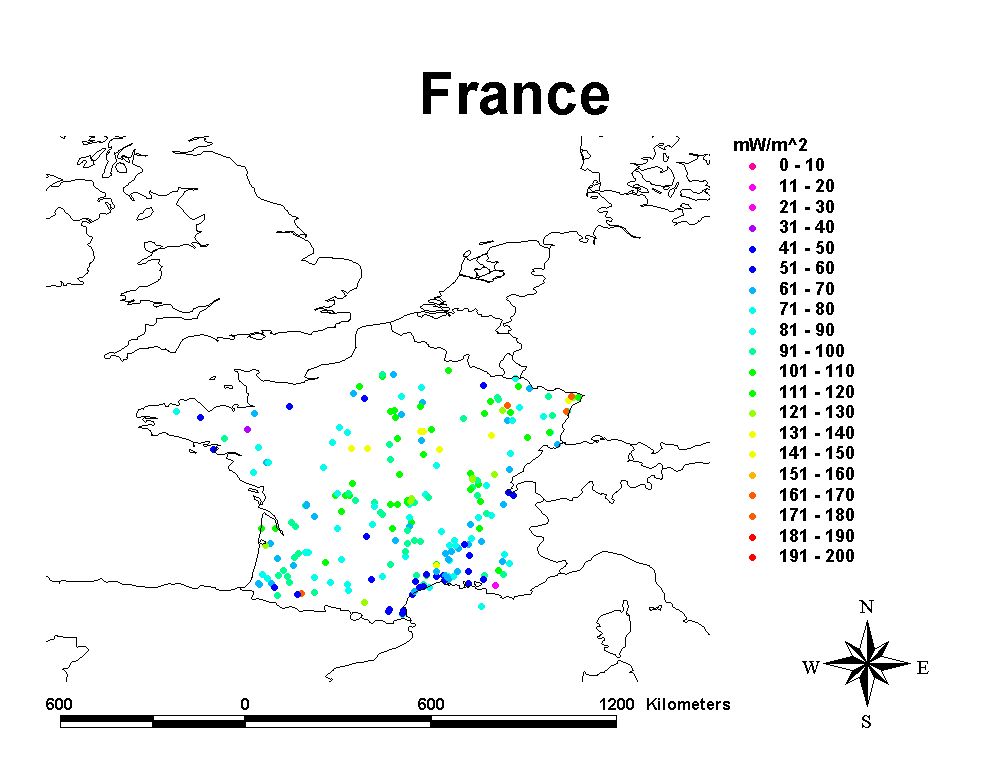
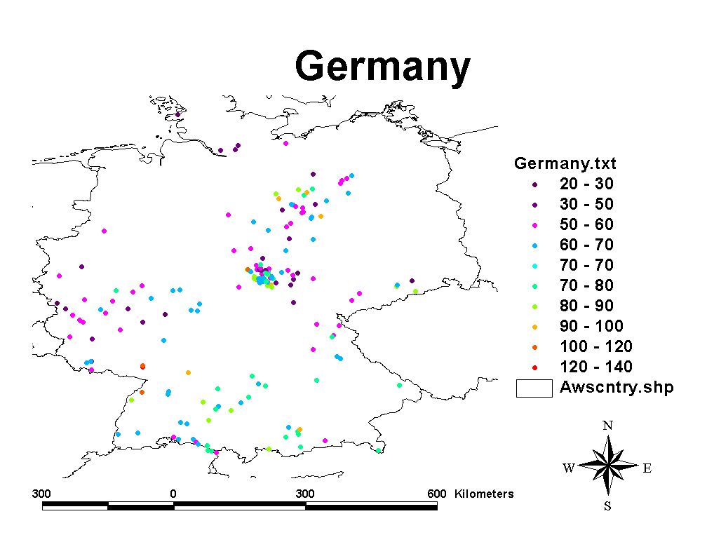
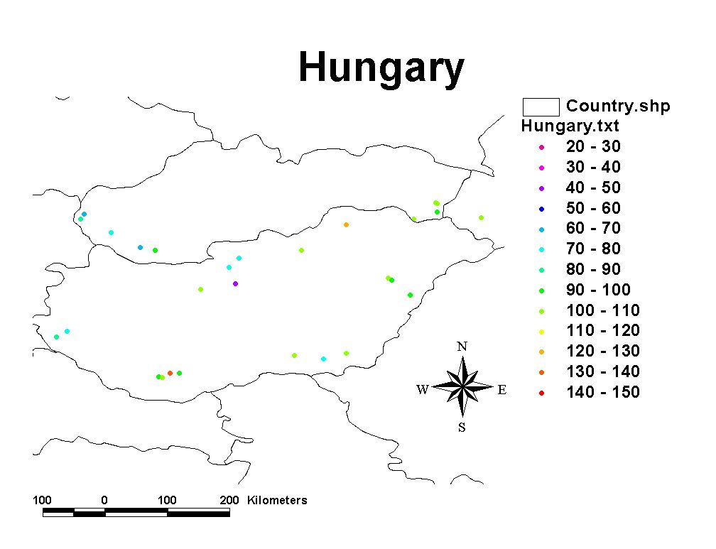
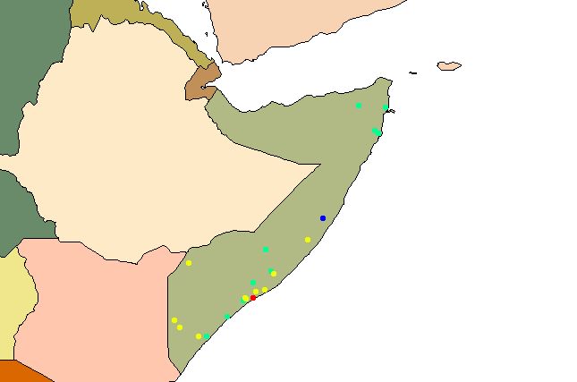
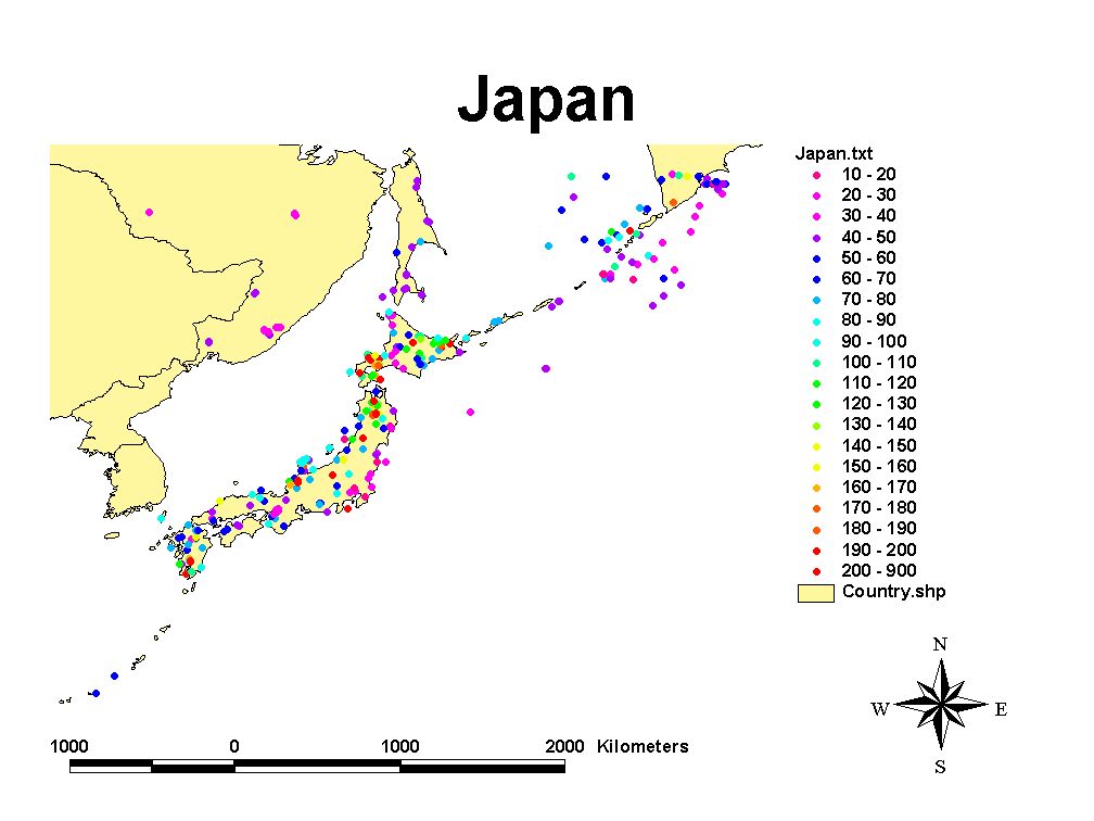
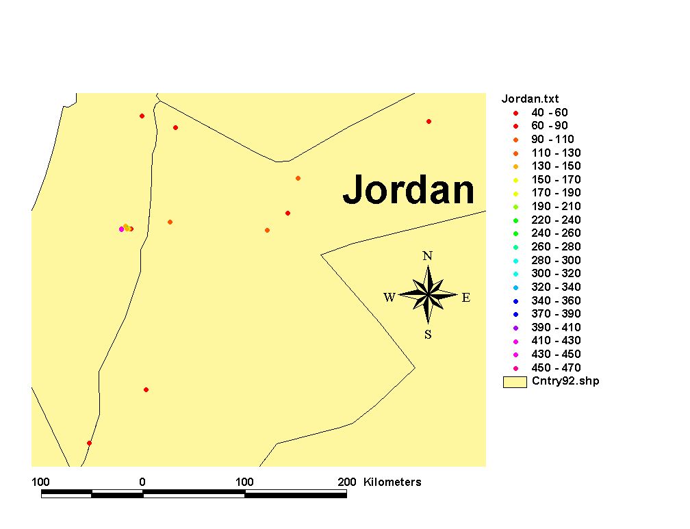
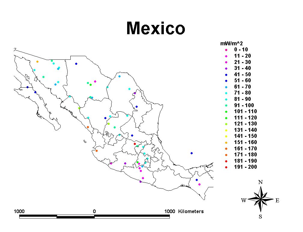
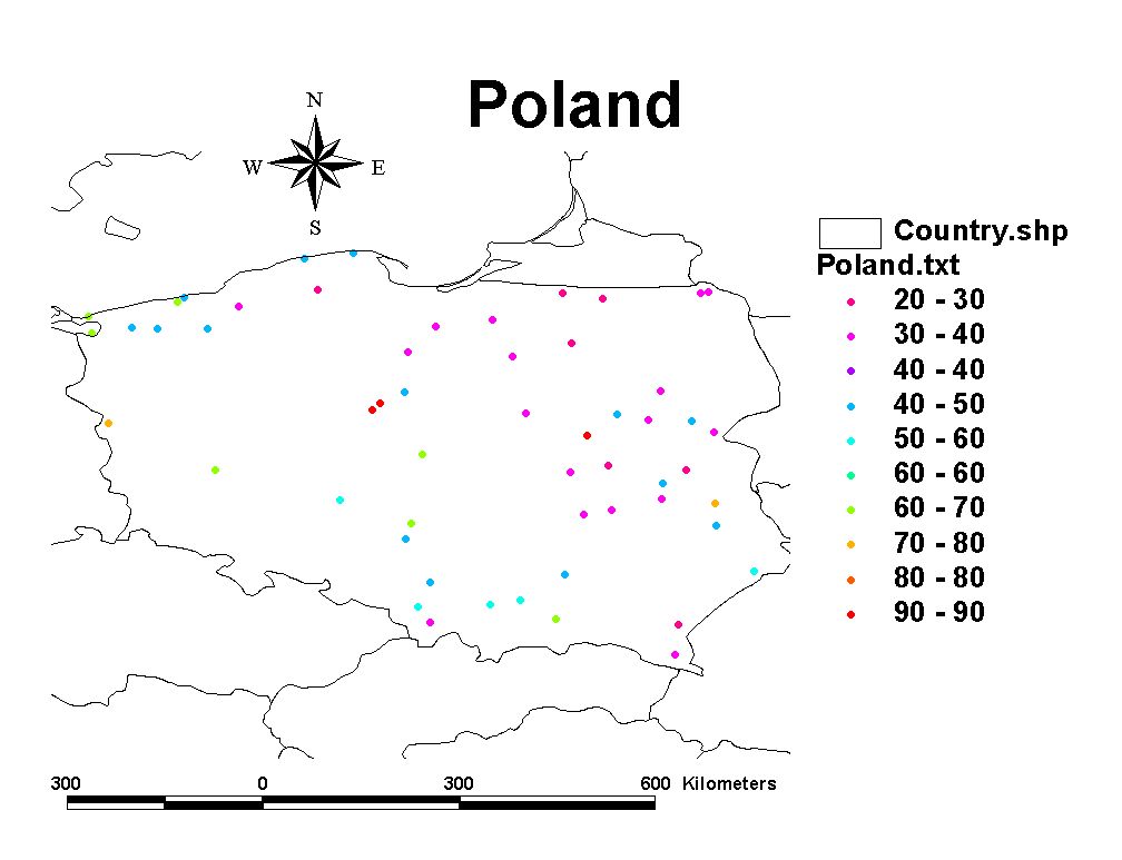
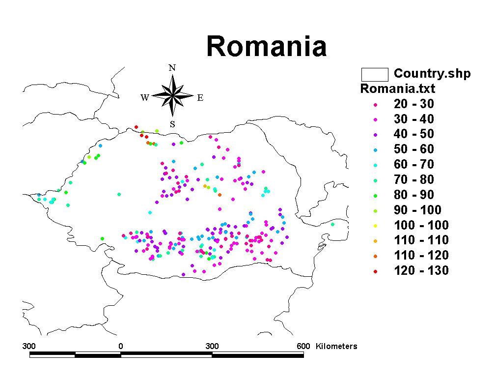
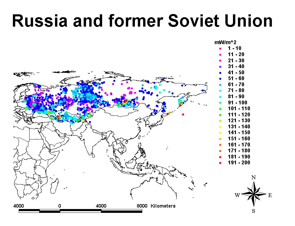
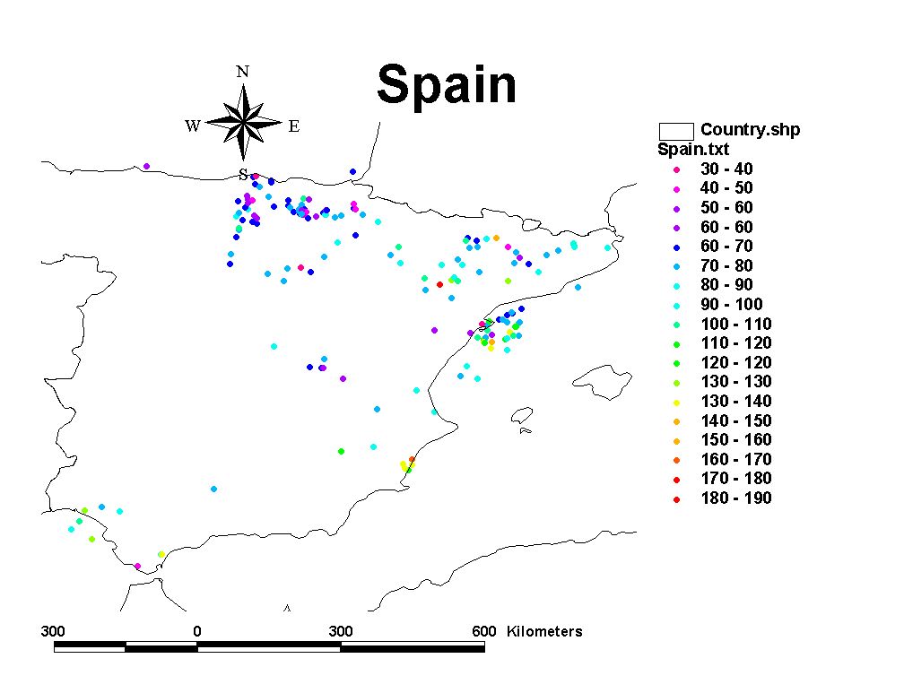
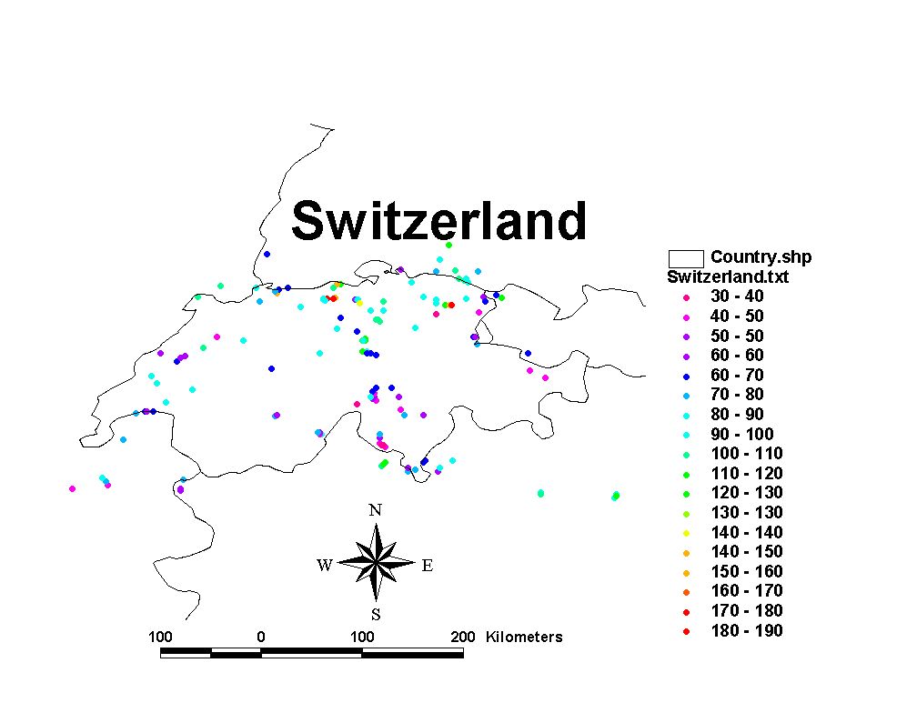
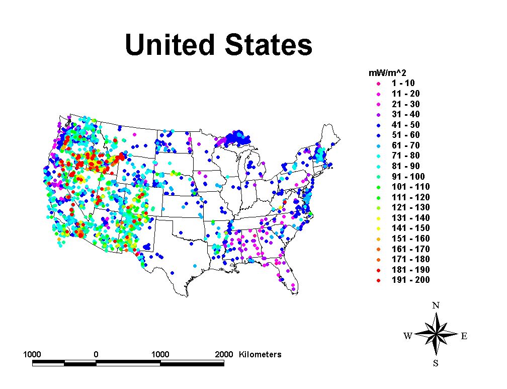
Heat flow data may be viewed on maps showing data locations. Maps showing data contours are in preparation and will be available only for continents, oceans, and countries with adequate data for contouring.
To view data location maps select from the list below. Data are presented in a color coded format using the visible light spectrum so that warm colors (reds) indicate high heat flow and cool colors (violet) indicate low heat flow. The spectral range for each data map is 0 to 200 mW/ m^2 in intervals of 20 mW/ m^2. Heat flows greater than 200 mW/ m^2 are assigned the warmest color.